 By
By 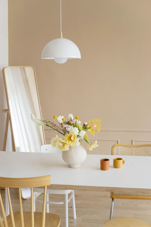
Choosing calm colours for your home can make each room feel more comfortable, balanced, and welcoming. Soft shades can help create a peaceful atmosphere, while carefully chosen accents add personality without making a space feel busy.
Calm colours do not have to mean plain white or pale beige. Gentle greens, muted blues, warm neutrals, soft greys, and earthy tones can all contribute to a relaxed look. The key is to consider how colours work with your lighting, furniture, and daily routines.
Start with the Feeling You Want
Before choosing paint or accessories, think about how you want the room to feel. A bedroom may suit a quiet, restful palette, while a living room may benefit from warmer colours that encourage conversation and comfort.
Ask yourself:
– Do I want the room to feel warm or cool?
– Should it feel bright and airy or cosy and grounded?
– Which colours do I already enjoy living with?
– Will the space be used for relaxing, working, entertaining, or several activities?
– Does the room need more visual warmth or a sense of openness?
Writing down a few words that describe your ideal space can make the selection process easier. Words such as peaceful, natural, welcoming, fresh, and cosy can guide your choices.
Understand Warm and Cool Colours
Colour temperature can affect the overall character of a room. Warm colours often include beige, cream, terracotta, peach, muted yellow, and soft brown. These shades can make a space feel inviting and comfortable.
Cool colours include blue, green, blue-grey, and some shades of lavender. They can give a room a fresh, quiet, and spacious feeling.
You do not need to use only warm or only cool colours. In fact, combining them can create a more balanced look. For example, soft blue walls may feel more welcoming when paired with warm wood, cream upholstery, or woven accessories.
If your room receives a lot of cool northern light, warm neutrals may help soften the space. Rooms with strong afternoon or southern light may work well with cooler tones that balance the natural brightness.
Consider Soft Neutrals
Soft neutrals are a reliable choice for creating a calm foundation. They are easy to coordinate and can make it simpler to update furniture and accessories over time.
Popular options include:
– Warm white
– Pale beige
– Greige, a blend of grey and beige
– Soft taupe
– Light mushroom
– Gentle stone
– Muted blue-grey
When selecting a neutral, pay attention to its undertone. Some whites have yellow or cream undertones, while others have blue or grey undertones. A neutral that looks warm in one room may appear cooler in another because of the lighting.
To create a layered look, combine several related neutrals rather than using one shade throughout the entire space. For example, you could pair warm white walls with a taupe rug, beige curtains, and light wood furniture.
Explore Nature-Inspired Colours
Colours inspired by nature often feel calm because they connect a room with familiar outdoor surroundings. Soft sage, dusty olive, pale sky blue, sand, clay, and muted brown can bring character without overwhelming the space.
Green is especially versatile. A pale sage can feel light and fresh, while a deeper moss shade creates a more grounded atmosphere. Blue can range from a barely-there tint to a rich muted navy, depending on how much contrast you want.
Earthy colours also pair well with natural materials such as:
– Wood
– Linen
– Cotton
– Rattan
– Stone
– Jute
– Ceramic
Using natural textures alongside calm colours keeps the room from feeling flat. A simple palette can look more interesting when different materials are included.
Keep the Colour Palette Simple
A calm room usually benefits from a limited colour palette. A useful approach is to choose three main colour groups:
- **A dominant colour:** This covers the largest areas, such as walls, floors, or large furniture.
- **A supporting colour:** This adds variation through curtains, rugs, bedding, or upholstery.
- **An accent colour:** This provides small touches of contrast through cushions, artwork, lamps, or decorative objects.
The colours do not need to match exactly. They should simply feel related. For example, a room might use warm white as the dominant colour, soft sage as the supporting shade, and muted terracotta as an accent.
Repeating one or two colours in different parts of the room can help the design feel connected. You might repeat a soft blue in a rug, artwork, and a pair of cushions.
Think About Natural and Artificial Light
Lighting can significantly change how a colour appears. Natural light changes throughout the day, while light bulbs can make colours look warmer, cooler, brighter, or darker.
Before making a final decision, test your preferred colours in the actual room. Paint small samples on several walls, or use large sample boards that can be moved around the space.
Check the samples:
– In the morning
– Around midday
– In the evening
– With the room lights on
– Beside existing furniture and flooring
Avoid judging a colour from a small paper card alone. A shade may look soft and subtle in a shop but much stronger when applied across a large wall.
Use Contrast Carefully
Calm does not mean every element must be the same colour. Gentle contrast adds definition and keeps a room from looking dull.
Try pairing:
– Cream with soft brown
– Pale blue with warm white
– Sage with natural wood
– Light grey with charcoal accents
– Sand with muted terracotta
– Taupe with dusty rose
For a subtle effect, keep contrast within a similar level of brightness. For more visual interest, add one deeper shade in small amounts. Darker accents work well on picture frames, side tables, cushions, lighting fixtures, or interior doors.
Choose Colours Room by Room
A whole-home palette can feel cohesive without making every room identical. Start with one main shade or undertone that appears throughout the home, then adapt the colours to suit each space.
For example:
– Living room: Warm neutrals, soft greens, or muted blue can create a welcoming setting.
– Bedroom: Gentle blue, warm white, pale lavender, or soft taupe can support a quiet mood.
– Kitchen: Cream, light greige, sage, and muted blue can complement wood and stone finishes.
– Bathroom: Soft grey, pale green, and sandy beige can give the space a clean, natural appearance.
– Home office: Blue-grey, muted green, or warm beige can provide a focused yet comfortable backdrop.
Use nearby rooms as part of your planning. Colours that can be seen from one space to another should work well together, even if they are not the same.
Add Personality with Small Accents
If you prefer a mostly neutral home, accents are an easy way to introduce colour without making a permanent change. Try adding colour through items that can be replaced or moved, such as:
– Cushions
– Throws
– Artwork
– Vases
– Table lamps
– Area rugs
– Curtains
– Books and decorative objects
Start with a few pieces rather than adding everything at once. This allows you to see how the colour feels in the room and prevents the space from becoming visually crowded.
Avoid Choosing Colours in Isolation
A colour should be considered alongside the features that will remain in the room. Flooring, countertops, cabinetry, furniture, metal finishes, and window coverings can all influence how a shade looks.
Bring samples of these materials together before deciding. A warm beige may coordinate beautifully with oak flooring but appear out of place beside cool white tile. Similarly, a blue-grey wall may look balanced with silver fixtures but less harmonious with strongly yellow-toned wood.
The goal is not to find a perfect colour in isolation. It is to find a shade that works with the complete room.
Make the Final Choice Gradually
Choosing calm colours does not need to happen all at once. Begin with a simple base, test your samples, and live with them for a few days. Notice how the room looks at different times and whether the colour works with your everyday belongings.
When in doubt, choose a shade that is slightly softer and less intense than your first instinct. You can always add stronger colour through accessories, artwork, and textiles.
With thoughtful testing and a simple plan, calm colours can make your home feel coordinated, comfortable, and personal.